iOS 7: The Best Features Coming to Apple's Made-Over Software

Steve Williams

Site Founder, Site Owner, Administrator
By JOANNA STERN | Good Morning America

Your iPhone and iPad might never look the same come this fall.
No, we don't know what the next versions of the iPad and iPhone hardware will look like, but we might not need to. Apple Monday revealed the next version of its mobile software iOS 7, and it's the makeover of makeovers. Think a "Pretty Woman"-size makeover.
Apple CEO Tim Cook even said, "This is the biggest change to iOS since the introduction of the iPhone."
The completely redesigned software will be out this fall for the iPhone 4, iPhone 4S and iPhone 5. So what's going to be happening to your phone? Here are five of our favorite new features.

1. Design
Whether you were getting sick of the look of Apple's iOS, you can still appreciate the new look and feel of the software. Gone are the textures, gone are the patterned backgrounds, gone is the notepad-looking Notes app. They have been replaced with cleaner design elements, including lots of white space and brighter colors.
But while the house might have gotten a new shade of paint and all new furniture, the layout is still familiar. You still get the familiar grid of icons, pull-down notification tray and more.

2. Control Center
But it's not all just skin deep. There are a slew of new features, including one that will save you a lot of time digging through the settings menu. Swipe up from the bottom of the phone and you will now see a new set of easy-access controls. You can easily access your Wi-Fi, Bluetooth and Airplane mode toggles and adjust the brightness and volume. You can also turn on Apple's new built-in flashlight (bye-bye flashlight apps!) and control your music. Small addition? Maybe, but huge time saver.

3. Multitasking
In iOS 7, you still switch to another app in the same way by double-tapping the home button, but now you get a new interface, which shows you what is happening in your app. You will see a card of the main screen of the apps you have open. You can tap to switch to it or, similar to Android or webOS, swipe it up to close it.

4. Siri
Siri has matured with a new voice and a new brain. Siri now has male and female voices and, according to Apple, will be faster at answering questions. It also can find full results from Bing, Wikipedia and Twitter. And like the rest of the operating system, Siri has a new look. The service will also be finding its way to cars in 2014.

5. Photos/Camera
There are loads of new camera and photos features. In the Camera app there is a brand new interface, which lets you apply filters right to your photo. Yes, it's like having Instagram built in to your camera, without the whole sharing thing.
But Apple has rolled out a new sharing option called AirDrop, which lets you easily select friends and share your photos wirelessly. There's also a host of new photo organization features; iOS will take care of organizing your photos based on the date and location you took them.
Apple says iOS 7 will be out later this fall. Of course, Apple's rumored to release a new iPhone around then, too.
 

Keith_W

Well-Known Member
Mar 31, 2012
1,024
95
970
Melbourne, Australia
www.whatsbestforum.com
Another perspective: http://phandroid.com/2013/06/10/ios7-vs-android/

Today at WWDC 2013, Apple confirmed rumors of a completely new, and visually overhauled version of their mobile OS with upcoming release of iOS 7. Apple calls it the “biggest change to iOS since the iPhone” and has has finally done away with the realistic shiny buttons, leather, and felt. The new user interface is much more simple, colorful and places a greater focus on minimalism and typography. Sound familiar? It should.

iOS 7?s new look is almost the same minimal user interface Android users have been enjoying since Android 4.0 Ice Cream Sandwich debuted back in 2011. It was then Matias Duarte showed the world his beautiful “Holo UI” which placed emphasis on a simple, minimal design as well as the all new Roboto system font. This was seen as a rebirth for Android, (oddly enough, Apple calls iOS7 “a new chapter for iOS”) which typically relied on its utility rather than its good looks.

Android users are used to Apple biting off the OS, waiting for Google to do all the heavy lifting, before they swoop in and rebrand these ideas their own. Whether it’s multitasking, or their “Notification Center” – we’re starting to get used to it.

Since Apple is boasting the upcoming iOS 7 update as “the world’s most advanced mobile OS,” we figured we’d put that claim to the test. Let’s take a quick look at the UI from iOS 7?s all new applications, along with their new features and see how they compare to the current reigning champ, Android 4.2 Jelly Bean.


Home screen and lock screen

First up, iOS’ trademark lockscreen is now gone. Almost feels less Apple-ie not seeing it there (especially after they went through the trouble of patenting it), but they’ve really committed to minimal with their latest version. Nothing but text, and directions to “slide to unlock,” it’s plain and we can’t help but wonder how much more functional it would be with widgets.

The homescreen features a lot more eye candy this time around, with bright, flat, colorful icons that look very similar to the color pallet used with Google Play. The homescreen actually works with the gyroscope and when you tilt the phone, allowing you to almost see behind the icons. You may remember how jazzed I was to show you guys this feature last year with a free app called 3D-Effect Live Wallpaper. Yeah, it was pretty sweet. What’s next Apple, live wallpapers? Guess they gotta save something for iOS 8.

Apple says, they ran out of “felt and wood,” for iOS 7 which gave me a chuckle. While iOS 7 is definitely very minimal, I wouldn’t quite call it “Holo” or even Metro. There are no sharp edges to the design and everything has a very rounded look, more in tune with the UI from Any.Do (now available on Google Play) or the MIUI custom UI.

We can’t help but wonder if Apple was taking a jab at the competition when they said, “We don’t add features simply because we can… We add features only when they’re truly useful.” My take away was Android is apparently chock-full of features, but not all of them are actually useful. Guess Apple really loved our quick toggles because….


Control Center


Yes, quick toggles to quickly turn on/off basic system functions is one of the most useful features ever. I’ll admit, this also took awhile before we saw it integrated into stock Android, but like most things, we’ve been enjoying these since the early days of TouchWiz and Sense many years ago. We’re glad Apple finally found them “worthy” of including into iOS 7.


Mail, Weather, Messages

Like all the other apps, mail, weather, and messages were given a visual overhaul. Mail and messages now look very minimal and clean (gone are the hideous bubbles conversations we’ve since since iOS 1) and from what I’ve read, now feature swiping gestures to delete.

The new weather app was given a lot of attention during Apple’s presentation and while we admit, it is flashy, we’d just like to point out the fact that this is the same Yahoo app already available on the App Store and looks about as nice as the Sense 5 weather application. Something tells me Yahoo wont be updating the Android version of their app anytime soon. The thing is when it comes to weather, most Android users are used to not having to open an app to view it. We have the weather on our lockscreens, homescreens (and in Sense 5, BlinkFeed and app drawer) — so why go through the hassle of opening an app (unless you want extremely detailed info) when it’s always viewable at a glance?


Camera, Safari, Siri

Camera has gotten an all new look. There’s a lot of transparencies and yes, a more minimal UI. Users can select to crop a photo ahead of time for easy to posting to Instagram, and filters viewable in real time make it easy to post hipster photos directly to social networks without having to rely on Instagram. Of course (you knew this was coming), Android users have had multiple camera applications available in the Play Store that mimic this functionality to a tee. Apps like Camera 360 perform all these “new” iOS 7 features and more.

Safari has been updated with a smart search field that works similar to Google’s omni search bar. It’s also been updated with Google Chrome-like 3D tabs, which we found interesting. Whether you’re on iOS 6 or Android, you might want to try downloading Chrome for all these “new” features and more (tab syncing, games, etc.).

Siri was also given a revamp, and where some Android OEM’s have gone out of their way to copy the old UI (I’m looking at you, Samsung), it’s now super minimal, with a kind of glass UI that allows you to still see your homescreen underneath.

Apparently Siri’s also been given a bevvy of new features like better Twitter and Wikipedia integration, as well as the ability to pull up searches directly from, uhhhhh.. well this is embarassing….. ummm, Bing. I did like the ability to choose between male or female Siri in a variety of languages, so Apple definitely gets points there. Overall, Google Voice Search is improving everyday and because Android is becoming more modulated, users no longer have to wait for an entire firmware update before they can get updates with the latest features. This means Google Voice Search has the potential to advance at a much quicker pace and we’re sure something Google is focusing on.


iTunes Radio


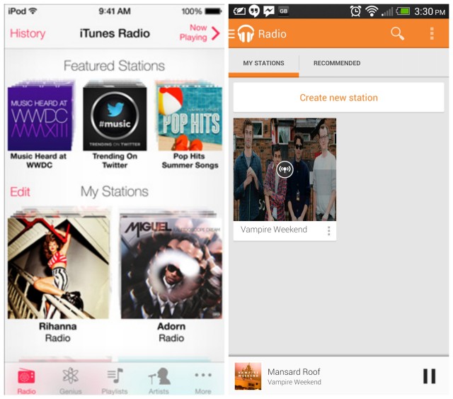
Apple has also introduced their new iTunes Radio which some are labeling a “Pandora killer.” It offers the similar functionality, allowing users to listen to music stations and buy a songs on the fly. It’s ad-based, but for iOS users who sign up for iTunes Match (where they store their music in the cloud for streaming), can get it ad-free. Google recently updated Google Play Music with similar functionality, giving the app the ability to play music stations, purchase music, stream music stored in the cloud, oh — and/or pay $8 a month to stream all the music they want, when they want. Boom.


Airdrop

AirDrop is probably my favorite feature from iOS 7. Basically, it’s makes sharing photos with other iOS users a wonderfully simple process. If someone near you is in your contacts, you simply select the photos/videos/files you want to send, then the contact and boom. You’re off. Android Beam has been around since Android 4.0 and allows you to beam photos, contacts, webpages, and apps to another Android device using NFC but in my usage has been rather finicky (especially with smartphone cases getting in the way).

We’ve also seen similar implementations from manufacturers running custom UI’s on Android, but tapping devices together seems almost barbaric vs wireless. Because not every Android device has NFC built in, that too is a downside. Fortunately, there are other options like Bump which allow you to send not just photos, but share any file on a device with others (protip: you don’t have to physically bump devices to transfer, just shake them near each other).


Multitasking


Apple has finally got on the ball and introduced multitasking across any and all applications downloaded from their App Store. It took them awhile, but it looks like they’ve finally caught up to Android by simply keeping all apps open in the background. Their implementation is visual very similar to WebOS, allowing for the user to pull up cards of all the apps opened in the background, swiping them up off the screen to close them out. It’s definitely pretty but again, something Android users have been enjoying for quite some time now.


Calculator


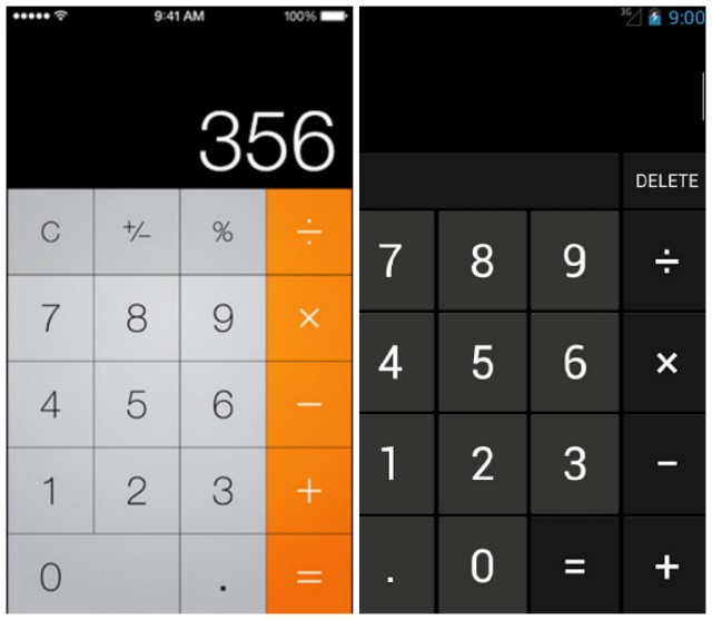
While all the iOS 7 systems apps have been spiffed up, I just found it interesting how visually similar their new calculator app was in comparison to Androids. While it’s true, there’s only so much you can do with a calculator UI, if they rounded out the corners it’d be less obvious where their app drew its inspiration.


Conclusion

The point of this post wasn’t to simply trash Apple or iOS 7. I was genuinely excited to see something new out of WWDC and was kinda bummed out to walk away empty handed. Like some of you, I actually enjoy a good fight and I know that good competition fuels innovation and pushes companies to try harder and deliver even better products. While it’s sad to see Apple no longer the “innovator” they once were, Android users now have OEM’s like Samsung and HTC to turn to for new ideas in terms of hardware and software.

You’ve really got to hand it to the Android developers, they’ve really done an incredible job at making Android not just functional, but beautiful as well. So beautiful it seems Apple is now looking to Android for design ideas, instead of the other way around. When it comes to the next version of Android _._ Key Lime Pie, Google may have only to outdo themselves.
 

Keith_W

Well-Known Member
Mar 31, 2012
1,024
95
970
Melbourne, Australia
www.whatsbestforum.com
From The Verge: The Design of iOS7: simply confusing.

What I saw today at Apple's annual WWDC event in the new iOS 7 was a radical departure from the previous design of the company's operating system — what CEO Tim Cook called "a stunning new user interface." But whether this new design is actually good design, well, that's a different story entirely.

Apple did indeed tout a completely rethought mobile OS, one which isn't technically a great distance from its predecessor but is an incredible deviation on design. Gone are lush, skeuomorphic objects, dials, and textures (in fact, Apple took several potshots at itself about the faux-felt and wood textures of the iOS of yesteryear). Instead, they have been replaced with stark, largely white and open app spaces; colorful, almost childlike icons; pencil thin, abstract controls for settings. New, Gaussian blur-transparency layers slide over your content, creating thick smears of soft color; notifications and other incidental information float above your work area on semi-translucent panels.

THE ICONS ARE THE FIRST MISSTEPS IN APPLE'S NEW APPROACH

The icons are striking to see, and they're the first sign that there are points of confusion and even missteps in Apple's new approach. For starters, the icon styles vary wildly from app to app. Game Center is now a collection of 3D globs, rendered together against a white background, while the Camera icon recalls something more like clip-art — an icon set against a rudimentary gray gradient that seems to want to be more abstract than it is. It looks shockingly basic, and more childish than elegant. The same goes for Weather, an amateur mishmash of sun, clouds, and a gradient background that was highlighted as part of Apple's new "grid system." It might be on a grid, but it doesn't look very good. The Maps icon is a mess: too many colors and lines intersecting at once. Messages' word balloon is so puffed up and oversized compared to its fine point that it looks like it will topple over. Another journalist remarked to me that the Settings icon looked more like an oven burner than a set of gears. I agreed, and still do now as I sit looking at it. It looks like clip-art of an oven burner, and again, that lazy gradient isn't doing the icon any favors.

Weirdly, though there wasn't any mention of active icons in iOS 7, the calendar displays the correct date (as it always has), and the clock icon is updated with the current time in all the screenshots we've seen. Weather, however, frustratingly remains unchanged. Don't even get me started on weather. Okay, fine: again Apple seems to ignore the utility of glanceable information, keeping safely to an annoying dance of swipes and secret menus to get to basic information... like the current temperature.

AGAIN APPLE SEEMS TO IGNORE THE UTILITY OF GLANCEABLE INFORMATION

But with the icons, there's an enormous feeling that Apple's designers couldn't decide on a direction. And for all the jokes about skeumorphism, I would have preferred something nearer to the company's previous efforts than the new set, which seems closer to bathroom signage than even the Windows Phone's plainness.

It's not just that the icons on the homescreen feel and look like the work of a lesser designer. They also vary across the system. For instance, the camera icon is a different shape in other sections of the OS, like the camera app or the lockscreen. Shouldn't there be some consistency?

Elsewhere there is trouble — instead of correcting issues with the notification panel and alerts, Apple has simply given them a fresh coat of paint and several layers of sub-navigation. Your notifications will still interrupt your work at the top of the screen, and when you slide down the panel you're now presented with the option of flipping between the kinds of notifications you want to see. Even closing notifications looks harder, the small "X" box now nearly invisible against that soft blur background. But fundamentally these are unimproved from Apple's last attempt, offering no action to take (which the company did actually just add to the forthcoming version of OS X), and doing nothing to actually speed up your productivity on the device.

The Control Center, a new option which can be summoned with a quick swipe up from the bottom of the screen, is actually a great idea but its design and organization of items is bizarre. It is an odd, jarring collection of functions. Toggles for oft-used controls, a brightness bar, a music player? AirDrop accessibility? A flashlight app? The clock? It feels like for lack of a better location Apple lumped all the other stuff into a single, messy space that floats above your onscreen content, making the already busy utility a visual strain. The idea is good, the execution is troubling.

Inside apps, iconography has been transported from the familiar to the confusing. Take a look at those new controls in Safari. What's that box with the arrow on top of it? It appears to be your sharing options, but it doesn't look like any sharing icon you know. It's almost as if in an attempt to move away from familiar shapes and textures, Apple has confused its design with new shapes and textures — weird ones. Less useful ones.

But it's not all a loss, or a miss. In fact, there are some extremely beautiful aspects of iOS 7 — aspects that lead me to believe that the raw materials for a more cohesive and useful OS are there, if perhaps a little buried.

THE RAW MATERIALS ARE THERE, IF PERHAPS BURIED

The typography in the majority of the apps is gorgeous, leaning heavily on Helvetica Neue and putting an emphasis on bigger, more readable type. App redesigns from the Calendar to the Camera introduce welcome changes. A new multitasker finally gets it right with what amounts to a carbon copy of the webOS card methodology. Little changes like the subtle, gyroscope-responsive parallax wallpapers, the ability to open notifications and controls on your lockscreen, and the new back gesture within apps show that Apple is still invested in the tiniest details.

Apple is showing that it can adapt, borrow, and tweak ideas from the competition, that it can expand what iOS feels and looks like as well as what it can do. The problem now is that it seems to be buckling a bit under the weight of an end-to-end redesign. I'm hopeful that in the next few months, as Apple ramps up for the introduction of new hardware at its fall event, some of the design and functionality issues that have yet to be addressed will be nipped and tucked. And perhaps the designers and engineers in Cupertino will revisit simply bad design decisions, like those obstructing notifications or the cluttered Control Center.

Until then, however, at least Apple fans and foes have something new to argue about.
 

asiufy

Industry Expert/VIP Donor
Jul 8, 2011
3,711
723
1,200
San Diego, CA
almaaudio.com
That first "article" is nauseating.
The guy that wrote that should have his journalist license/diploma revoked :)
But hey, what else is new? APPLE IS DOOMED, RUN!!!


alexandre
 

Keith_W

Well-Known Member
Mar 31, 2012
1,024
95
970
Melbourne, Australia
www.whatsbestforum.com
That first "article" is nauseating.
The guy that wrote that should have his journalist license/diploma revoked :)
But hey, what else is new? APPLE IS DOOMED, RUN!!!

The article is completely spot on though. Apple is drip feeding its consumers innovations which have been on Android for years. I can tell you that a new theme with new flat icons wouldn't even make the news in the Android world - that is because we are free to install whatever theme we like, whatever launcher we like, and even whatever custom ROM we like. If we don't like something we can remove it, if we want something we can add it.

I can't help but watch in amusement as iOS users have kittens over this list of massively underwhelming and completely boring features that don't even offer what Android offered in 2010. Android users don't live in a world where a cyber dictator makes decisions for all of us then forces us to live with those decisions. Apple users do.
 

asiufy

Industry Expert/VIP Donor
Jul 8, 2011
3,711
723
1,200
San Diego, CA
almaaudio.com
AND WE LOVE IT! :D


alexandre
 

Keith_W

Well-Known Member
Mar 31, 2012
1,024
95
970
Melbourne, Australia
www.whatsbestforum.com
Reactions to iOS 7:

- On 9to5mac (an Apple fanboy website), we have Susan Kare (designer of the original Mac icons) giving iOS7 the thumbs down: http://9to5mac.com/2013/06/13/desig...con-and-many-others-gives-thumbs-up-to-ios-7/

- Designers are unimpressed with Jony Ives' new OS: http://www.theatlanticwire.com/technology/2013/06/apple-new-ios-7-reviews/66115/

- A new Tumblr site lampooning Ives: Jony Ives Redesigns Things.

- Laptop Magazine compares iOS7 to Android, notes that many features on iOS7 are copied from Android, and despite the updates they are still behind: http://blog.laptopmag.com/10-ways-android-beats-ios-7

- A similar article on Digital Trends: http://www.digitaltrends.com/mobile/ios-vs-android/

If Google were to mess up and deliver a version of Android with horrible pink and fluoro neon gradient icons, we could at least download an icon pack and change the look of every icon in the system. This is what Apple fans are stuck with:


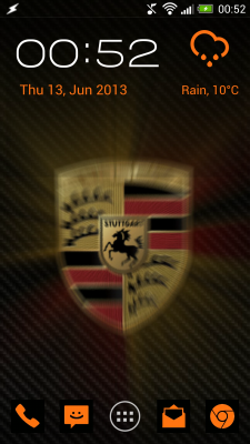
In contrast, Android is so flexible that you can customize it to your heart's content:


And, if you really wanted to, you could make your Android look like iOS:


Keith_W

Well-Known Member
Mar 31, 2012
1,024
95
970
Melbourne, Australia
www.whatsbestforum.com
How many years have we had the iPhone, Steve? 7 years? It hasn't changed very much, has it. Every year Apple decides to drip feed new "features" to its fanbase which have been available on the competition for years. Cut and paste? LTE? A larger screen? Feh! :)
 

Steve Williams

Site Founder, Site Owner, Administrator
but Keith

sometimes you need to take a deep breath

Please tell me how the new icon look will doom iOs7

After all, that POS plastic case on the Galaxy doesn't seem to detract from the masses continuing to buy it. After all this is now Galaxy S4. Feh is what I say too ;)
 

FrantzM

Member Sponsor & WBF Founding Member
Apr 20, 2010
6,455
29
405
Since this is turning into an android vs iOS thread ... I have tested the HTC One and by gosh that could be the best phone out there. I sincerely don't see in what way the iPhone is its superior ... Finish is exceptional and performance superb.

It also seems to me that android phones are moving ahead of the iPhone ... Apple IOS still seems to have a better "feel" for the lack of a better word but in no way can one call it superior . All that IMHO, of course

Typed on an iPad :)
 

asiufy

Industry Expert/VIP Donor
Jul 8, 2011
3,711
723
1,200
San Diego, CA
almaaudio.com
I was impressed with that one as well.
The interface was a step up from the Samsung flashy crap, and the bare bones Android uglyness.
It was very fast and responsive, and the finish is indeed superb. Samsung should be ashamed of selling that plastic crap.


alexandre
 

Keith_W

Well-Known Member
Mar 31, 2012
1,024
95
970
Melbourne, Australia
www.whatsbestforum.com
Please tell me how the new icon look will doom iOs7

After all, that POS plastic case on the Galaxy doesn't seem to detract from the masses continuing to buy it. After all this is now Galaxy S4. Feh is what I say too ;)

It's not only the new icons that is sinking Apple, Steve. It is the lack of innovation. When Android moved from 4.0 to 4.2, they did not change their version number. But look at all the new things that 4.2 brought along with it:

- Google Now
- Project Butter
- Predictive keyboard with swipe functionality
- Offline speech recognition
- Improved notification system

When iOS moved from iOS6 to iOS7, it brought with it a new version number. These are the landmark improvements:

- new user interface
- command center (similar to Android quick settings, introduced in 2012)
- Airdrop file sharing (similar to Android Beam, introduced in 2011)
- improved multitasking (but still not full multitasking, available in Android since 2009)
- automatic app updates (available in Android since the very beginning)

All its major improvements are copied from Android or other mobile OS'es, and it still lags behind Android in terms of features. You are stuck with the gawdy appearance of iOS7 - there is nothing you can do about it. Likewise, Siri still opens addresses in Apple Maps. If you want to use Google maps, you have to cut and paste. There is still no proper file sharing. Apple treats its users like mugs.

Since this is turning into an android vs iOS thread ... I have tested the HTC One and by gosh that could be the best phone out there. I sincerely don't see in what way the iPhone is its superior ... Finish is exceptional and performance superb.

Quite a few of my friends have switched from iPhone to the HTC One when their contracts came up. I bought my HTC One the day it came out, and I have since extensively customized it :)

I have a smartphone that sets itself up the moment I walk in to my office, or walk into my home, without any intervention on my behalf. It knows where I am and loads up a profile of settings that I want (e.g. bluetooth, wifi and mobile data status, ring volume, whether to notify me of emails and by whom, which callers I will accept and which I won't, etc). For example, my phone book is organized into work contacts, friends, favourites, and blocked. Nobody from my blocked list can call, ever. The phone sends them to voicemail without even ringing. Work contacts can't call me after 11pm. If they try to call, the phone sends them an SMS that says "This phone is on silent. If you reply this SMS with the word "URGENT" the phone will ring". That is what I call a "smart" phone.

The interface was a step up from the Samsung flashy crap, and the bare bones Android uglyness.

I should note that Apple is copying the flat interface of Android and Microsoft. Late to the party as usual :)
 

asiufy

Industry Expert/VIP Donor
Jul 8, 2011
3,711
723
1,200
San Diego, CA
almaaudio.com
Microsoft yes, Android default, no.
There's a word of difference between the appearance of Android's quick settings, and Apple's command center.
And btw, look what I found, on an Android enthusiast (aka "fanboy") site no less:

http://androidandme.com/2013/06/opi...from-the-best-to-worst-tablet-ive-ever-owned/

Quote:

"The first time I used a Nexus 7, I was blown away. It was the perfect form factor for Android, and probably the best Android device I had ever used at the time. All for just $200. You simply couldn’t ask for more in a device. One year later, I’m changing my tune. My Nexus 7 is just a shell of its former self, and an embarrassment to Google.I don’t remember when it first started happening, but most say it was when Android 4.2 began hitting devices. The new features and changes in Jelly Bean, 4.2, were certainly welcome additions, but my Nexus’ new found love of life in the slow-lane was not. I have not spent a full year using the Nexus 7 as a daily driver, only the last six months. So at first, I didn’t notice just how bad things had gotten. I thought maybe it was an illusion from using so many high-end Android phones. Until I started asking around.I can’t find one person who has been using the Nexus 7 for an extended period of time, and hasn’t seen a massive downgrade in performance. Just what kind of downgrade are we talking here? I cannot pick up my Nexus 7 without experiencing problems like a lag of ten seconds, or more, just to rotate the display; touches refusing to acknowledged; stuttering notification panel actions; and unresponsive apps."


My 2010 iPad runs FASTER than when I originally bought it. Sure, Apple doesn't add gazillion features nobody wants. But what they add is relevant (to its users, at least), and doesn't boggle the system down.

There's a parallel here to the MacOS x Windows past. Microsoft was all too quick to add the kitchen sink to its OS, while dragging its performance down, and requiring beefier machines (and thus giving Intel incentive to create faster processors --- see, not such a bad thing). MacOS on the other hand frequently got FASTER between revisions, on the same harder.

The new MacOS (10.9) runs on the same Macs that 10.8 ran. And the Developer Preview runs FASTER, even with all the debugging code in. iOS 7 --- the same. Faster than iOS 6 on the same iPhone 5, doing a lot more eye candy.

alexandre


amirm

Banned
Apr 2, 2010
15,813
38
0
Seattle, WA
"The first time I used a Nexus 7, I was blown away. It was the perfect form factor for Android, and probably the best Android device I had ever used at the time. All for just $200. You simply couldn’t ask for more in a device. One year later, I’m changing my tune. My Nexus 7 is just a shell of its former self, and an embarrassment to Google.[/FONT][/COLOR]I don’t remember when it first started happening, but most say it was when Android 4.2 began hitting devices. The new features and changes in Jelly Bean, 4.2, were certainly welcome additions, but my Nexus’ new found love of life in the slow-lane was not. I have not spent a full year using the Nexus 7 as a daily driver, only the last six months. So at first, I didn’t notice just how bad things had gotten. I thought maybe it was an illusion from using so many high-end Android phones. Until I started asking around.I can’t find one person who has been using the Nexus 7 for an extended period of time, and hasn’t seen a massive downgrade in performance. Just what kind of downgrade are we talking here? I cannot pick up my Nexus 7 without experiencing problems like a lag of ten seconds, or more, just to rotate the display; touches refusing to acknowledged; stuttering notification panel actions; and unresponsive apps."

I have noted the same before. My first gen Moto phone was very buggy. Google sent out two updates to fix the bugs which it did. But it massively slowed down the phone. I put up with it for a while and then upgraded. I think this was the classic engineer testing on latest models and not the older. There was no way any of the bug fixes should have slowed down anything. But they were not paying attention and made other changes that slowed down older phones.

My 2010 iPad runs FASTER than when I originally bought it. Sure, Apple doesn't add gazillion features nobody wants. But what they add is relevant (to its users, at least), and doesn't boggle the system down.
Let's be fair though. I had to upgrade my phone anyway to get 4G. As did iPhone users. So while I am harsh on Google for above as a practical matter, it happened at the right time in that the hardware was getting obsoleted.

There's a parallel here to the MacOS x Windows past. Microsoft was all too quick to add the kitchen sink to its OS, while dragging its performance down, and requiring beefier machines (and thus giving Intel incentive to create faster processors --- see, not such a bad thing). MacOS on the other hand frequently got FASTER between revisions, on the same harder.
True of Vista that was a disaster. I remember being close to "code complete" and my machine would take 3-4 times longer to boot as XP and everything would run so slow. Thousands of people were dumping code in there who had no idea of computer performance -- again running things on fast desktops (mine was a laptop). The perf team worked night and day to get Vista to run at all and shipped it, too early of course. Windows 7 finished the optimization. I have not used Windows 8 but i hear it is faster.

I have not used a Mac computer for years. But still remember the fiasco decisions they made. Remember when they switched from Motorola CPUs to PowerPC and *emulated* a ton of the old OS code including networking? Who has heard of emulating the OS code instead of recompiling it for the new CPU??? That was when I gave up and switched back to Windows and could not believe the huge performance boost. And oh, Apple had to switch CPUs yet again to X86 CPU which Windows used. So it is not all peachy there.
 

DaveyF

Well-Known Member
Jul 31, 2010
6,129
181
458
La Jolla, Calif USA
I have noted the same before. My first gen Moto phone was very buggy. Google sent out two updates to fix the bugs which it did. But it massively slowed down the phone. I put up with it for a while and then upgraded. I think this was the classic engineer testing on latest models and not the older. There was no way any of the bug fixes should have slowed down anything. But they were not paying attention and made other changes that slowed down older phones.


Let's be fair though. I had to upgrade my phone anyway to get 4G. As did iPhone users. So while I am harsh on Google for above as a practical matter, it happened at the right time in that the hardware was getting obsoleted.


True of Vista that was a disaster. I remember being close to "code complete" and my machine would take 3-4 times longer to boot as XP and everything would run so slow. Thousands of people were dumping code in there who had no idea of computer performance -- again running things on fast desktops (mine was a laptop). The perf team worked night and day to get Vista to run at all and shipped it, too early of course. Windows 7 finished the optimization. I have not used Windows 8 but i hear it is faster.

I have not used a Mac computer for years. But still remember the fiasco decisions they made. Remember when they switched from Motorola CPUs to PowerPC and *emulated* a ton of the old OS code including networking? Who has heard of emulating the OS code instead of recompiling it for the new CPU??? That was when I gave up and switched back to Windows and could not believe the huge performance boost. And oh, Apple had to switch CPUs yet again to X86 CPU which Windows used. So it is not all peachy there.


Amir, for some reason I'm getting the impression that you are a PC lover, LOL;):D:eek:
 

About us

  • What’s Best Forum is THE forum for high end audio, product reviews, advice and sharing experiences on the best of everything else. This is THE place where audiophiles and audio companies discuss vintage, contemporary and new audio products, music servers, music streamers, computer audio, digital-to-analog converters, turntables, phono stages, cartridges, reel-to-reel tape machines, speakers, headphones and tube and solid-state amplification. Founded in 2010 What’s Best Forum invites intelligent and courteous people of all interests and backgrounds to describe and discuss the best of everything. From beginners to life-long hobbyists to industry professionals, we enjoy learning about new things and meeting new people, and participating in spirited debates.

Quick Navigation

User Menu

Steve Williams
Site Founder | Site Owner | Administrator
Ron Resnick
Site Co-Owner | Administrator
Julian (The Fixer)
Website Build | Marketing Managersing